
BOOX Go 7 vs Go Color 7 (Gen II): Is Colour E Ink Worth It?
The Go 7 and the Go Color 7 (Gen II) are near twins: the same 7″ footprint, the same page-turn buttons, the same microSD slot, the same open Android with every reading app you can name. The whole decision comes down to one component, the screen, and that decision is easier than it looks once you know what you read. This page is the head-to-head; for what the series is for, where the Page fits and how the Go 7 sits between the Go 6 and the Go 10.3, start with the Go 7 buying guide.
At a glance
| Go 7 | Go Color 7 (Gen II) | |
|---|---|---|
| Screen | 7″ Carta1300, black and white | 7″ Kaleido 3, 4,096 colours |
| Sharpness | 300 ppi everywhere | 300 ppi B&W, 150 ppi colour |
| Background | Brighter, higher contrast | Slightly darker due to colour filter |
| Buttons | Physical page-turn buttons | Physical page-turn buttons |
| Storage | 64 GB plus microSD | 64 GB plus microSD |
| Stylus | Optional InkSense support | Optional InkSense support |
| Best for | Novels, articles, pure text | Comics, manga, magazines, kids' books |
How colour E Ink actually works
Kaleido 3 adds a colour filter layer on top of a black-and-white E Ink panel. That buys you 4,096 colours with all the usual E Ink virtues: sunlight readability, weeks of battery, no glow in your face at night. It also has two honest costs. Colour content renders at 150 ppi rather than 300, so it is softer than the text around it. And the filter layer sits between you and the page, so the background is a shade darker than a pure monochrome screen. Good front lighting compensates, but side by side, the difference is visible.
None of this is a flaw. It is the trade every colour E Ink device on the market makes. The question is whether you read the kind of content that cashes in on it.
When colour is worth it
- Comics and manga. Covers, colour pages, and graphic novels are the single best argument for Kaleido 3. Reading them in greyscale loses real information.
- Magazines and picture-heavy PDFs. Charts, photos, and layouts keep their meaning.
- Kids' books. Illustrated children's books in colour on a screen that cannot strain their eyes is a genuinely great combination.
- Colour highlighting. If you study or annotate, a four-colour highlight system beats shades of grey.
When black and white is the better read
If your library is novels, non-fiction, news, and long articles, the Go 7 is simply the better screen for the job. Every pixel serves the text, the page is brighter, and the contrast is the best a 7″ BOOX has ever offered thanks to the newer Carta1300 panel. Colour you never use is not a bonus. It is a small permanent tax on the reading experience you actually have.
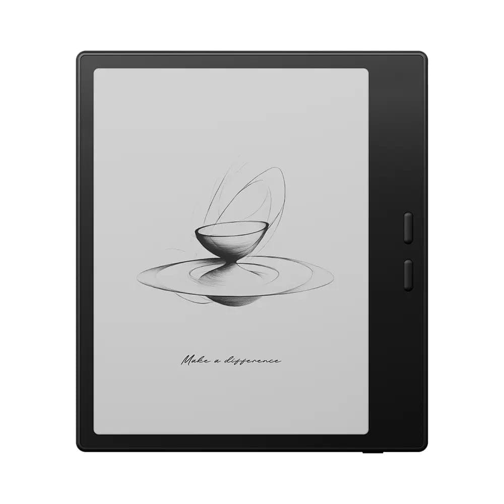 BOOX 7" Go 7 ( Black )$342.99
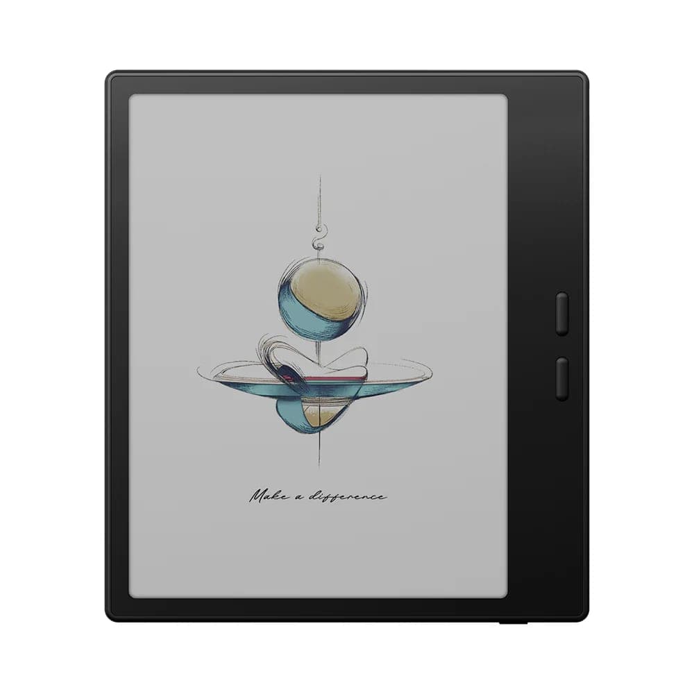 BOOX 7" Go Color 7 - Gen II (Black)$369.99
Everything they share
It is worth repeating how much is identical, because it means neither choice sacrifices the fundamentals: pocketable size around 190 to 195 g, real page-turn buttons, USB-C, expandable storage by microSD, optional stylus support for margin notes, and open Android. Kindle, Kobo, and Libby all run on both, so your existing library follows you either way. Both take the same magnetic case, and the Go 7 is available in black or white.
Our recommendation
- Choose the Go 7 if you read mostly text. Sharper, brighter, and everything a dedicated reader should be.
- Choose the Go Color 7 (Gen II) if comics, manga, magazines, or illustrated books make up a meaningful slice of your reading, or if colour highlights matter to how you study.
- The honest tiebreaker: if you are unsure whether you read enough colour content to justify it, you probably do not, and the Go 7 will serve you better.
The fastest way to settle it is to see the two screens side by side, which you can do at our showroom in Oakville, Ontario. Free shipping across Canada, 30-day returns on new devices, and occasional open-box units at a discount, sold as final sale.