
BOOX Go 7 ou Go Color 7 (Gen II) : l'encre couleur en vaut-elle la peine?
Le Go 7 et le Go Color 7 (Gen II) sont de quasi-jumeaux : même gabarit de 7″, mêmes boutons de changement de page, même fente microSD, même Android ouvert avec toutes les applis de lecture imaginables. Toute la décision repose sur une seule composante, l'écran, et cette décision est plus simple qu'elle en a l'air une fois que vous savez ce que vous lisez. Cette page est le face à face; pour savoir à quoi sert la série, où se situe le Page et comment le Go 7 se place entre le Go 6 et le Go 10.3, commencez par le guide d'achat Go 7.
En un coup d'œil
| Go 7 | Go Color 7 (Gen II) | |
|---|---|---|
| Écran | Carta1300 de 7″, noir et blanc | Kaleido 3 de 7″, 4 096 couleurs |
| Netteté | 300 ppp partout | 300 ppp en noir et blanc, 150 ppp en couleur |
| Fond de page | Plus lumineux, contraste plus élevé | Légèrement plus sombre à cause du filtre couleur |
| Boutons | Boutons physiques de changement de page | Boutons physiques de changement de page |
| Stockage | 64 Go plus microSD | 64 Go plus microSD |
| Stylet | Prise en charge InkSense en option | Prise en charge InkSense en option |
| Idéal pour | Romans, articles, texte pur | BD, mangas, magazines, livres pour enfants |
Comment l'encre couleur fonctionne vraiment
Kaleido 3 ajoute une couche de filtre couleur par-dessus un panneau E Ink noir et blanc. Vous y gagnez 4 096 couleurs avec toutes les vertus habituelles de l'encre électronique : lisibilité en plein soleil, des semaines d'autonomie, aucune lumière dans le visage le soir. Il y a aussi deux coûts bien réels. Le contenu en couleur s'affiche à 150 ppp plutôt qu'à 300, donc il est plus doux que le texte qui l'entoure. Et la couche de filtre s'interpose entre vous et la page, si bien que le fond est un ton plus sombre qu'un écran purement monochrome. Un bon éclairage frontal compense, mais côte à côte, la différence se voit.
Rien de tout cela n'est un défaut. C'est le compromis que fait chaque appareil E Ink couleur sur le marché. La question est de savoir si vous lisez le genre de contenu qui en profite.
Quand la couleur en vaut la peine
- BD et mangas. Les couvertures, les pages couleur et les romans graphiques sont le meilleur argument pour Kaleido 3. Les lire en nuances de gris, c'est perdre de la vraie information.
- Magazines et PDF riches en images. Graphiques, photos et mises en page gardent tout leur sens.
- Livres pour enfants. Des albums illustrés en couleur sur un écran qui ne fatigue pas leurs yeux, c'est une combinaison franchement gagnante.
- Surlignage en couleur. Si vous étudiez ou annotez, un système de surlignage à quatre couleurs bat des nuances de gris.
Quand le noir et blanc offre la meilleure lecture
Si votre bibliothèque se compose de romans, d'essais, de nouvelles et de longs articles, le Go 7 est tout simplement le meilleur écran pour la tâche. Chaque pixel sert le texte, la page est plus lumineuse, et le contraste est le meilleur jamais offert sur un BOOX de 7″ grâce au nouveau panneau Carta1300. Une couleur que vous n'utilisez jamais n'est pas un bonus. C'est une petite taxe permanente sur l'expérience de lecture que vous avez réellement.
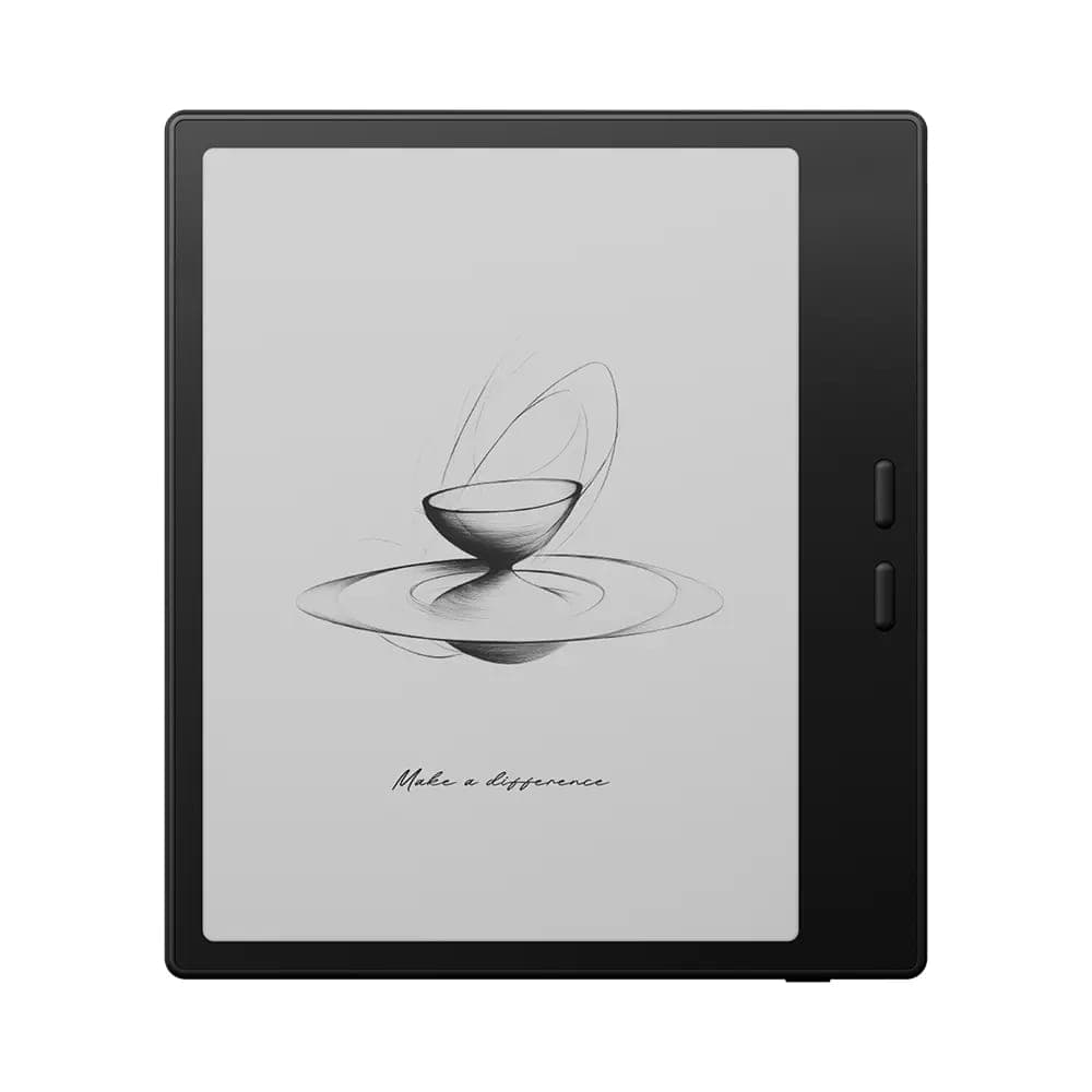 BOOX 7" Go 7 ( Black )342,99 $
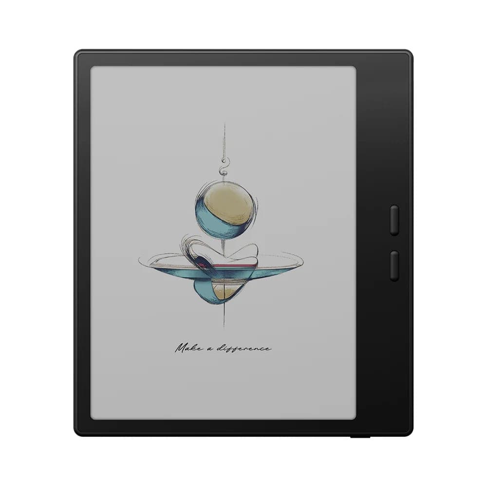 BOOX 7" Go Color 7 - Gen II (Black)369,99 $
Tout ce qu'ils partagent
Ça vaut la peine de répéter à quel point tout le reste est identique, parce que ça signifie qu'aucun des deux choix ne sacrifie l'essentiel : format de poche autour de 190 à 195 g, vrais boutons de changement de page, USB-C, stockage extensible par microSD, prise en charge d'un stylet en option pour les notes en marge, et Android ouvert. Kindle, Kobo et Libby tournent sur les deux, alors votre bibliothèque actuelle vous suit dans un cas comme dans l'autre. Les deux acceptent le même étui magnétique, et le Go 7 est offert en noir ou en blanc.
Notre recommandation
- Choisissez le Go 7 si vous lisez surtout du texte. Plus net, plus lumineux, et tout ce qu'une liseuse dédiée devrait être.
- Choisissez le Go Color 7 (Gen II) si les BD, les mangas, les magazines ou les livres illustrés occupent une part importante de vos lectures, ou si le surlignage en couleur compte dans votre façon d'étudier.
- Le juge de paix, en toute honnêteté : si vous vous demandez si vous lisez assez de contenu en couleur pour le justifier, la réponse est probablement non, et le Go 7 vous servira mieux.
La façon la plus rapide de trancher reste de voir les deux écrans côte à côte, ce que vous pouvez faire à notre salle de montre d'Oakville, en Ontario. Livraison gratuite partout au Canada, retours sous 30 jours sur les appareils neufs, et à l'occasion des unités en boîte ouverte à prix d'aubaine, vendues en vente finale.